Acronym Landing Page
When I first joined Acronym, I remember looking at their old website and having no idea what they actually did. So, I was very excited when we started working on a new website and wanted to develop content that explained their business goals and value proposition in simpler language and took advantage of a more modern design created in WordPress. I used everything I’d learned in the past few years as a content developer to tell a more engaging story about their brand which I am proud of.
Detailed summary:
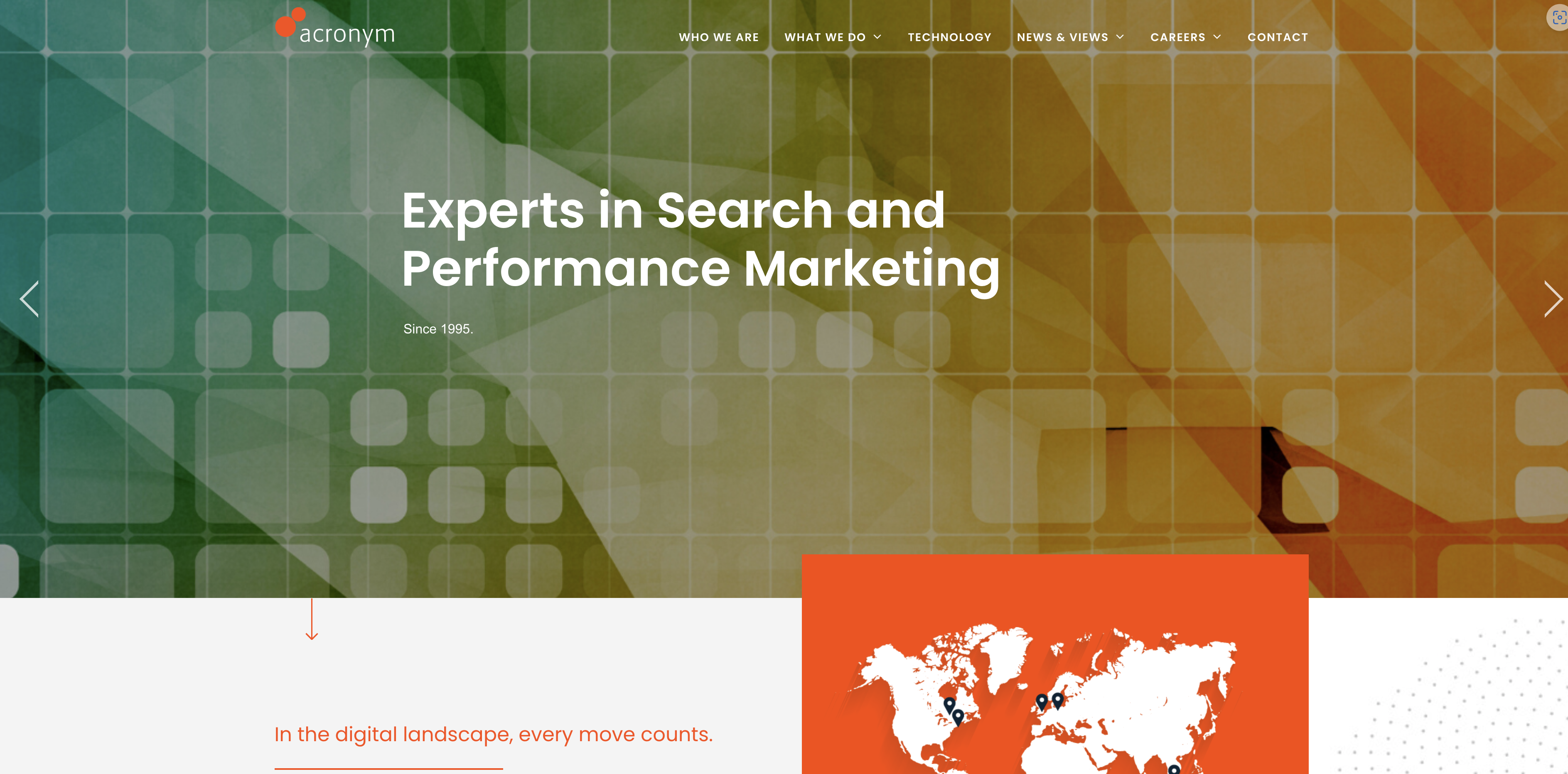
Acronym Media is a leading search and performance marketing agency which serves enterprise clients across the globe. Their SaaS keyword optimization and analytics tools are designed for the needs of the world’s most complex organizations. Since 1995 they have using cutting edge data intelligence and expertise across all channels and stages of the buyer journey to give their clients a unique edge in a crowded landscape across multiple verticals. Acronym tracks over a billion keywords for clients and are the agency of record for powerhouse companies ranging from the Four Seasons to SAP to PayPal The executive team agreed that their website had been outdated for a long time and needed a refresh. For a company so focused on digital excellence, the website needed to look cleaner and more refined while taking advantage of the latest web design trends. It was also important to increase clarity and have a clear CTA for their most important intended audience, marketing procurement officers from organizations around the world. They needed to highlight the prestige of their brand and its unique history and services, while maintaining an on-brand tone in their copy and design elements. Work on the website began in March 2020 and continued until October 2020 when the new website was unveiled. While I had originally worked exclusively as a content writer, I had been practicing simple web design using WordPress and asked for an opportunity to contribute to the design elements as well as the copy for the site. My copywriting work appears across the new website, including blog posts and case studies but in terms of design I focused on the landing page. To start, I asked myself what a busy procurement officer at a large business would want to see in a potential search marketing provider. The copy needed to be clear and simple while more concisely explaining what Acronym provides for its clients in terms of search optimization. The design needed to be cleaner and less crowded while focusing on Acronym’s most important selling points which included a global presence with headquarters in the Empire State Building, an award-winning legacy starting in 1995, state of the art software and a list of clients which includes some of the most recognizable brands in the world. Orange color was also very important to the chief executive.In collaboration with stakeholders, I decided to use a map of the world highlighting Acronym’s offices across the globe. In discussions, we a page highlighting Acronym’s industry-leading technology was a top priority, as well as a page detailing their rich history. Cards for each of Acronym’s main channels, SEO, PPC and Social Media would all link to a what we do page that explained in simple terms what Acronym does for its clients. The next part was showing off Acronym’s impressive list of clients, partners and accomplished team members. Logo grids were used for clients and partners. We also decided to link to a blog page which included POV’s from Acronym’s lead executives. I wrote many of these posts myself until my time at the company ended in August 2021. My landing page content was well received by team members and I was made responsible for content on the rest of the website. My copywriting across all pages of the website served as a draft which was iteratively edited through feedback from the executive team.
link: acronym.com
Before


After